Healthwise is an iOS app where users can find doctors, schedule appointments, manage prescriptions, message their health team, see their preventive care schedule, and more, all in one place.
✨ Inspiration and Background ✨
Women in the US face inferior healthcare compared to men, including less access to pain medication [1], misdiagnosis due to male-centric medical data [2], and increasing political attacks on reproductive healthcare [3].
Due to this landscape, women tend to seek education in medical care, and want a better understanding of preventive care, easy access to medical records, and autonomy in medical decisions.
I wanted to create a way to help women navigate their healthcare and feel empowered to make the right medical decisions for themselves and their families.
The Process
Discover
User interviews
Competitive analysis
Secondary research
Define
User personas
Feature set ideation
and prioritization
Card sorting
Develop
Site mapping
Sketching
Branding
Wireframing
Prototyping
Test
Usability testing
Analyzing test results
Design iterations
My Role
UX/UI Designer, UX Researcher
Tools
Figma, FigJam, Zoom, Otter.ai, Optimal Workshop
Discover
User Interviews
I conducted user interviews with 7 women, aged 30-42. All interview participants currently live in various parts of the United States. My research aimed to gain insight into their experiences and pain points in healthcare, especially as it pertains to reproductive and sexual health.
Affinity Mapping
The user interviews generated a large amount of qualitative data. I used affinity mapping to organize the information into grouped themes and extract insights. Most notably, all participants mentioned medical education and preventive care.
Insights
Desires
They wish there was more emphasis on preventive healthcare and understanding when certain screenings are needed
An app that “does it all”
Frustrations
Feeling dismissed, rushed, that their pain was not taken seriously, and feeling the need to advocate for themselves in order to get adequate care
Feeling there is not enough awareness and education about women’s health topics
What Users Want
Easy appointment scheduling, calendar syncing, and reminders
Managing prescriptions
Message center where they can communicate with their medical team
Access to medical records
Telehealth availability
Secondary Research
With secondary research, I was able to explore some common pain points that women experience when pursuing healthcare. I explored subreddits dedicated to women’s health to gain better understanding of patient experiences, and I read medical journals and articles to deepen my knowledge of the healthcare as an industry and how it’s being shaped by current events.
There is a large consensus that women’s healthcare “just sucks” and they are often expected to deal with preventable pain.
Women are distressed about their bodily autonomy, and personal agency in their care. There is a theme of women being denied procedures like hysterectomies or tuba ligation because medical providers are putting the desires of other - or even hypothetical - men in front of the very real needs of their patients.
Women are concerned for their health data privacy. Women are using period tracker apps less, mainly due to criminalization of abortions coupled with the fact that a missed period and an abortion look medically identical.
Competitive Analysis
After gathering all the user-centered data from interviews and secondary research, I wanted to see how these problems are addressed by competitors (if at all), identify what features are included in other leading platforms, and pinpoint potential areas where Healthwise could excel.
Define
✏️ Re-Defining the Problem
While I started with lofty goals of tacking inequity in women’s healthcare, I realized that was not particularly achievable without policy change and culture shift in the industry.
Through my research, I learned that women need a comprehensive solution to manage their healthcare effectively, encompassing greater awareness and education on health issues, increased agency and autonomy in medical decisions, better understanding of routine visits and preventive care, convenient methods of communication with their doctors, and easy access to their medical records.
User Personas
I created two user personas. Amy is a working mom of two, trying to manage her own healthcare as well as that of her children. And Kristy is a young professional who wants to stay on top of both her preventive care and her sexual health as a single woman.
Feature Set and Prioritization
I created a list of features focusing on user needs and concerns, with an eye toward providing agency for women to have more transparency and control over their medical treatments and full integration of sexual and reproductive healthcare. I prioritized the list for an MVP product while incorporating feedback from my interviewees to address their key needs first.
Card Sorting
I conducted closed card sorting to find out how potential users would group features for this product. The card sorting used 20 cards, 4 categories, and was completed by 10 participants. Users generally agreed on each category and organized cards as expected, with the exception of “Reminders / Follow-up actions.” I decided to go with my instinct on sorting this card into “My Care” because I suspected the participants didn’t understand the true purpose of this card.
Develop
Sitemapping
I used data from the card sorting to the create the sitemap below.
Branding & Visual Design
Brand Values
Respect Compassion Empowerment Wellness Collaborative Care
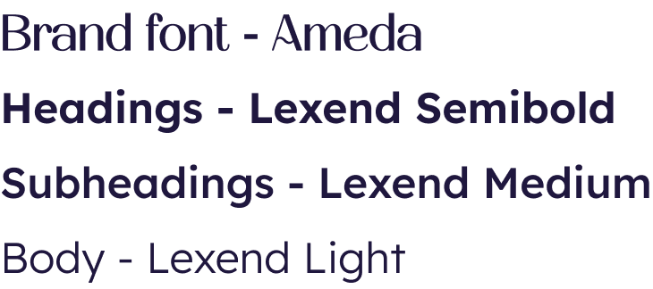
I made intentional decisions to blend a sense of calm, serenity, and modernity. I used the industry-standard blue color palette with a little twist, a touch of glassmorphism, hierarchical iconography with rounded edges, a modern and friendly font, and created a custom logo.
The cross shape of the logo represents a standard of the healthcare industry. The squiggle inside is intended to show two hands joining, illustrating the collaboration between medical staff and patients.
Logo
Colors
Typography
Iconography
Section Icons: used in tandem with bold section headers
Illustration Icons: used to increase understanding with accompanying body text
Low-Fi Wireframes
Hi-Fi Wireframes & Prototyping
Scheduling an Appointment
Preventive Care
Getting a New Doctor
Test
Usability Testing
Moderated usability testing was conducted remotely with six participants, and included four flows (listed below). Success for each task were measured by completion and error rates.
Scheduling an appointment
Requesting STI screening
Finding out when their next pap test is due, and learning about what to expect
Finding and assigning a new doctor to their Care Team
Analyzing Test Results
Success Metrics
100% completion rate for each flow
0% error rate for flows 1, 3, and 4
33% error rate for flow 2
What Worked
100% said this app would be useful for them in managing their healthcare.
There was a lot of positive feedback for the visual design, including the colors, the use of imagery, and a clear hierarchy.
Users found it very easy to access their preventive care, their due dates, and what to expect.
What Didn’t Work
A few users were confused about schedule an appointment by date vs doctor.
Finding a new doctor by category instead of using the search bar was a very popular path, and needs to be designed.
Users weren’t sure where to find STI screening.
Some general confusion with language in certain areas.
Design Iterations
Through the usability testing, I was able to learn a lot about the product and how users would interact with it. Using the test results listed above as well as other observations, I used IBM’s feedback grid to organize all my data and made the following revisions to the product interface.
Schedule an Appointment - Flow Improvement
A few users were confused about schedule an appointment by date vs by doctor.
→
I removed the choice of doctor vs date, and instead opted for a simpler visual choice between members of the user’s current Care Team and any doctor, with availability dates shown.
Although not called out in the usability testing, I also added filter and sort functions when opting for any doctor, and updated the date picker for increased usability.
Find a Doctor - Flow Improvement
Finding a new doctor by category instead of using the search bar was a very popular path. This path needed to designed, as well as improving the visibility and function of the search feature.
I designed a flow for choosing a doctor by category.
→
For the main search function, I used a brighter CTA color in the search bar to improve visibility, updated language, added a location radius. I also added more functions to the filters.
→
Although not called out in the usability testing, I also added clinic information in the doctor’s bio page for improved clarity and usability.
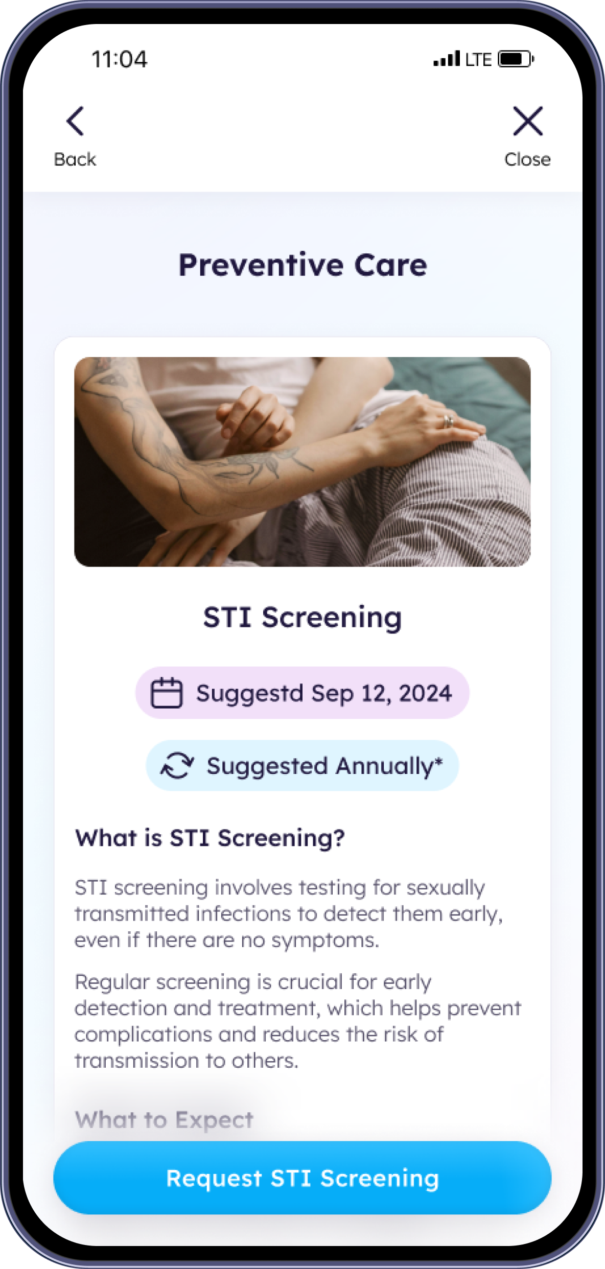
STI Screening - Improvements in Findability and Understanding
Users weren’t sure where to find STI screening.
→
I added a second entry point in the preventive care carousel where users can learn more about STI screening and request screening directly.
Final Product
What I Learned
I was thrilled to hear the unanimous positive reaction from the usability testing participants in regards to both functionality and visual design. Many even expressed a wish for Healthwise to become a real app.
The biggest challenge for this project was defining the problem in a way that both captured women’s biggest frustrations and offered a digital solution. During my user interviews, everyone expressed deep dissatisfaction with various aspects of healthcare. However, many of these pain points are only fully addressable with solutions like policy change or a culture shift in the medical industry.
I decided to approach the problem by focusing on what users wanted out of a healthcare management app while keeping their larger frustrations in mind. I incorporated elements of education and awareness through the Preventive Care Schedule. For users who had negative experiences with their current doctors, I made it easy to doctors, filter through options, read reviews, as well as submit complaints. I also designed an integration with Open AI’s DxGPT symptom checker to empower patients with research and knowledge before entering the doctor’s office.
If given more time, I would like continue developing the My Community function, enabling users to connect with others in similar medical situations (e.g., new moms, those living with breast cancer, etc.) and draw support from each other in these groups. Additionally, I would like to fully design the Personal Log so users can track their health events and bring personal data to their doctor’s appointments when needed.
I believe when all these functions come together cohesively, it could make a significant impact on women’s experiences with their healthcare.
NEXT PROJECT.
NEXT PROJECT.
Nesting Nomad Responsive Webiste
Nesting Nomad is a responsive website built for digital nomads where users can easily book and manage their short-term homes, productive co-working spaces, and authentic experiences.


