Nesting Nomad is a responsive website built for digital nomads where users can easily book and manage their short-term homes, productive co-working spaces, and authentic experiences.
Background
In the age of Covid-19, many companies and employees embraced remote work. This, along with an increasingly tech-savvy world, has led to the rise of “digital nomads” who travel freely while working remotely from may locations.
Balancing the allure of adventure with the need for stability and routine is an ongoing challenge for many in this unique work culture.
The Problem
Digital nomads often struggle to find adequate housing that meets their needs for both a home and a workspace.
They also struggle to maintain social connections, both with existing friends “back home” and meeting new people in their current location.
The Solution
A responsive website that users can easily access from their personal or work devices where they can book and manage their trips. This includes housing with plenty of verified filters so nomads can find the right fit in a temporary home, co-working spaces where they can be productive, authentic experiences where they can connect with locals and other travelers, and shareable trip itineraries if any friends from “back home” can join them for a joint adventure.
The Process
Discover
User surveys
Competitive analysis
Secondary research
Define
User personas
Feature set ideation
and prioritization
Site mapping
Develop
Sketching
Branding
Wireframing
Prototyping
Test
Usability testing
Analyzing test results
Design iterations
Tools
Figma, FigJam, Zoom, Otter.ai, Google Forms
My Role
UX/UI Designer, UX Researcher
Discover
Research Goals
I wanted to learn what digital nomads value in their housing so I can understand what would motivate them to rent a particular space and identify the current gaps that exist in their housing search.
I also wanted to learn what kinds of activities digital nomads like to do in their spare time, as well as their preferences and expectations of social engagement, so I can discover new ways to help them feel fulfilled socially and create a sense of belonging and community.
User Surveys
I created and circulated a survey to participants who identified as digital nomads with open-ended questions focused on identifying and exploring their experiences with housing, working remotely, and social connection.
Unfortunately and after much effort, I was only able to source two survey participants. I supplemented the survey data with lots of secondary research.
Secondary Research
With secondary research, I was able to explore some common pain points that digital nomads experience in their lifestyles. I researched statistical reports and testimonials on subreddits to supplement the user surveys, and I was able to identify some common themes.
Finding accommodations that have adequate amenities is a challenge. Because this is a temporary home, and not just a vacation, the importance of having a proper workspace, a comfortable bed, and a reasonable landlord is essential.
Most digital nomads work from their temporary home, yet a good amount still search for co-working spaces, libraries, or coffee shops to work from.
The primary pain point is loneliness and lack of friendship / community, often causing them to return home. Experienced digital nomads suggest engaging in classes, live events, hobbies, and coworking spaces to foster social connections.
Competitive Analysis
After gathering user-centered data from secondary research and my two survey participants, I wanted to see how these problems are addressed by competitors (if at all), identify what features are included in other leading platforms, and pinpoint potential areas where Nesting Nomad could specifically attract my target audience.
Insights
Housing
Digital nomads want to feel a sense of home in their accommodations.
One of the hardest things about being a digital nomad is finding, planning, and booking both travel and housing -- particularly finding accommodations that have adequate amenities. This is an area where most competitors are lacking.
Social Life
The most common pain point I found for digital nomads was definitely a feeling of loneliness.
Nomads can leverage events or groups involving shared interests and hobbies, or co-working spaces where they might have recurring encounters.
Nomads tend to miss the “back home” friends the most
Define
User Personas
Ethan is a software engineer, and wants to see the world while maintaining his career. He has trouble finding adequate housing that is both comfortable and includes a proper home office or workspace.
Jasmine is extroverted freelance designer, and and loves being able to truly call a multitude of places “home.” She wants to find ways to connect with other people who have common interests, and create new friendships.
Feature Set and Prioritization
I created a list of features focusing on the user needs of the two personas, with an emphasis in three areas:
Housing that feels like home, with user visibility to all the amenities and conveniences that digital nomads find most valuable.
Workspaces where digital nomads can feel productive and potentially connect with other young professionals, or simply get their work done.
Authentic, local experiences where digital nomads can take full advantage of their unique lifestyle and meet other travelers and locals alike.
Site Mapping
My approach was to follow similar design patterns I gleaned from the top-level competitors, while incorporating my unique features. I organized my sitemap using the three major sections of housing, workspaces, and experiences, along with a personalized account page for the user to view and manage all their bookings.
Develop
Low-Fi Wireframes
Based on the complexity of the product and the tech usage of digital nomads, I made the assumption that most users would be using this product on a desktop with fewer users accessing it on mobile. Therefore, I decided to design the desktop version first.
Branding & Visual Design
Brand Voice
Friendly Energetic Inclusive Cozy Trustworthy
Logo
I designed this custom logo of mountains and a sun inside of a location pin symbol to convey a sense of adventure while being unique and easily recognizable. The softly curled font evokes a feeling of coziness, which is a core value of the brand.
Colors
After a few iterations, I decided on this color palette because it feels trendy, young, and energetic, which matches the target demographic. The neutrals are all variations on a dark blue.
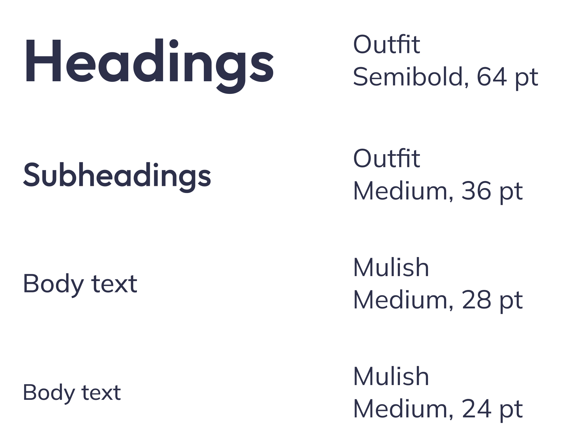
Typography
Iconography
Component Library
As an essential part of this product design, I constructed a complete component library to both ensure consistency and streamline future updates. The UI Kit included color and type styles, icons, cards, image carousels, filter menus, drop-down menus, date pickers, and more. While this was a significant commitment on the front-end, this approach led to saving time and effort in the hi-fi designs and later revisions.
Icons
Buttons
Filter menu
Hi-Fi Wireframes & Prototyping
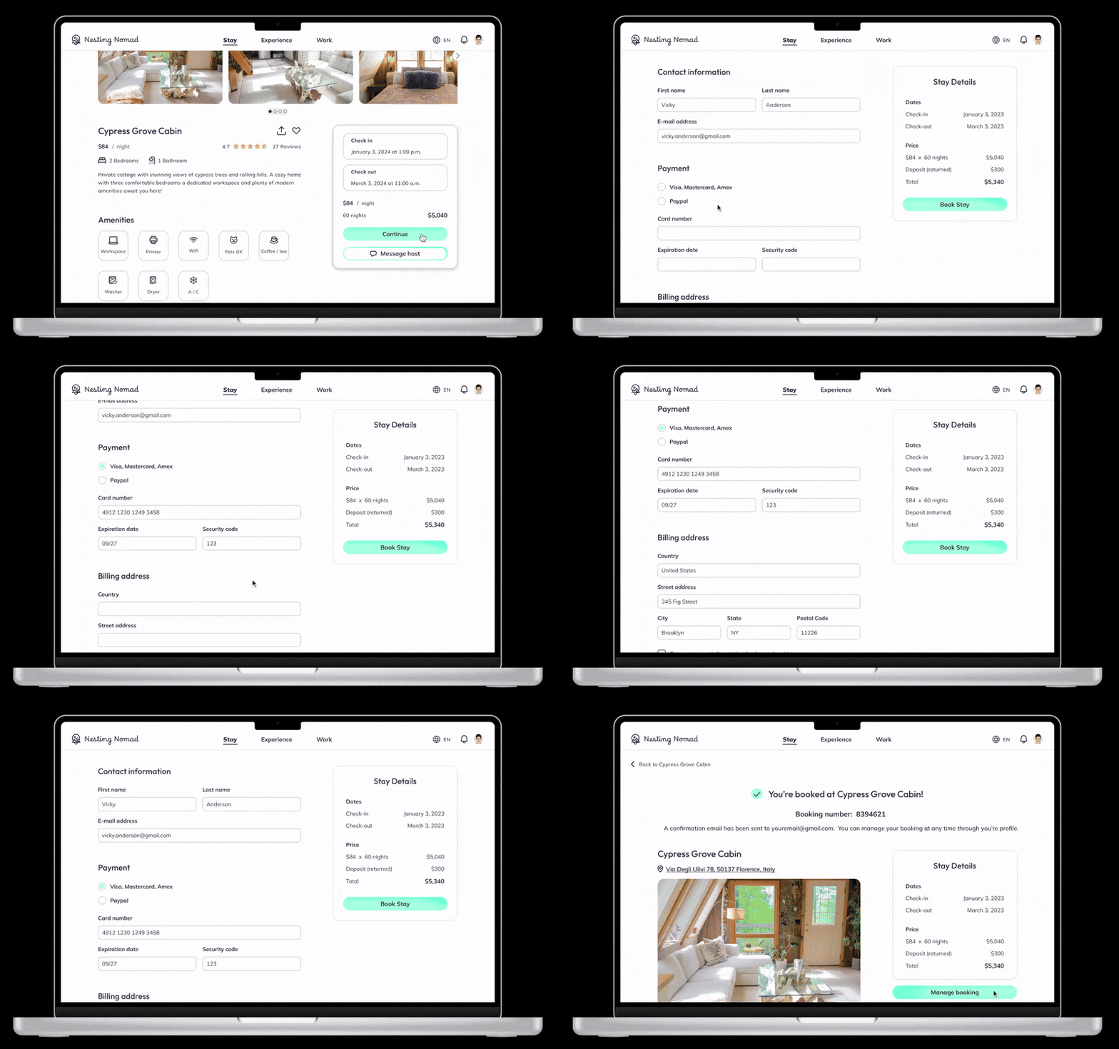
Searching for and booking a Stay
View Upcoming Trips
Messaging a Host
Test
Usability Testing
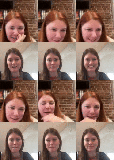
Moderated usability testing was conducted with five participants, and included four flows (listed below). Although test participants were not digital nomads themselves, the were all well-seasoned travelers and could mentally put themselves in the shoes of a digital nomad. Success for each task were measured by completion and error rates.
Logging in
Searching for and booking a Stay
Navigating to view all upcoming Trips
Messaging a host
Analyzing Test Results
100% completion rate for each flow
0% error rate for flows 1, 2, and 4
20% (1/5) error rate for flow 3
There was a lot of positive feedback for the visual design, the ease of use, and intuitive flows. All participants seemed to fully understand the purpose of the product, the information presented on each screen, and how to navigate to their desired goal.
The participants were very helpful in providing a lot of feedback. To help organize and analyze all the comments, I used Enterprise Design Thinking’s feedback grid.
What Worked
Login and messaging functions were very familiar and easy.
Users liked that all their bookings were consolidated and linked directly to the details of each booking.
Overall, users felt the product was uncomplicated and easy to use.
All users felt the product would be useful if they were digital nomads.
To Change
Not being able to fully view each review, and the lack of a pathway to view all the reviews.
The header for the “Trips” screen could be more clear.
Expectation to see all upcoming bookings on the (logged in) home/landing page.
Questions
Expectation to see a hamburger menu instead of account photo. It would be interested to do A/B testing to see if the menu or account picture provides more clarity.
Ideas
Inviting a traveling companion to collaborate on a Trip.
Being able to add multiple Stay bookings to a singe Trip.
Design Iterations
Through the usability testing, I was able to learn a lot about the product and how users would interact with it. Using the test results and user feedback, I prioritized the following revisions:
Updating the design of the “Trips” screen to bring more clarity and visual appeal, and adding a function of including multiple stays in one Trip, and including travel companions.
Updating the “Stay details” screen to allow for better visibility of reviews, having a clear price breakdown, and making finding nearby workspaces more clear.
Re-designing the Home/Landing page when logged in for the user to view all their upcoming bookings instead of focusing only on the Stays.
Trips
I redesigned the Trips screen to bring more clarity and visual appeal. I also added functions to combine multiple Stays in one Trip and include travel companions for a specific date range.
→
Stay
I updated the Stay details screen to include a clear price breakdown in the booking card, a way to see all reviews (and put reviews higher up in the page), added a carousel for nearby workspaces, and made it easier to search for workspaces in the map so the user has better visibility to the distance between the Stay and potential workspaces.
→
Home Page
I redesigned this screen for the logged-in version of the Home page so the user can view all their upcoming bookings consolidated into Trips (previously they only could see their booked Stays), as well as be a second entry point to their Trips.
→
Final Product
What I Learned
I was delighted to receive positive feedback from the usability testing participants regarding the visual design, ease of use, and intuitive flows.
The biggest challenge for this project was the lack of data from primary research (user surveys). To address this, I had to make some informed assumptions and rely heavily on secondary research sourced from online forums and marketing reports.
One aspect I wish I could have emphasized more is the inclusion of locally-owned housing and locally-led experiences. Moving forward, I would like to incorporate features that highlight these options in the online marketplace, giving users more visibility and agency to adopt ethical consumption habits in their nomadic lifestyles.
Overall, I am pleased with the outcome of this project. I created a platform where digital nomads can access the majority of their travel needs in one place. I believe Nesting Nomad would help digital nomads to find a true sense of home while building new connections and deepening existing friendships.
NEXT PROJECT.
NEXT PROJECT.
Adding a feature to Instagram
Categories is a new feature integration that tackles the mess that has overtaken our Instagram feeds.


